Charts & Metrics
Chart Guidance
Some charts on the dashboard have translucent outlines or dotted lines rendered directly into them to indicate a "goal state". This is meant to help you visually gauge how close or far you are from being done labeling a given class.
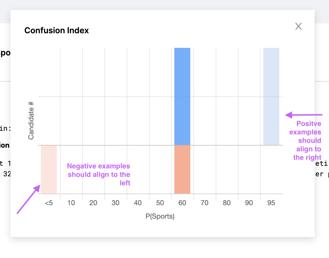
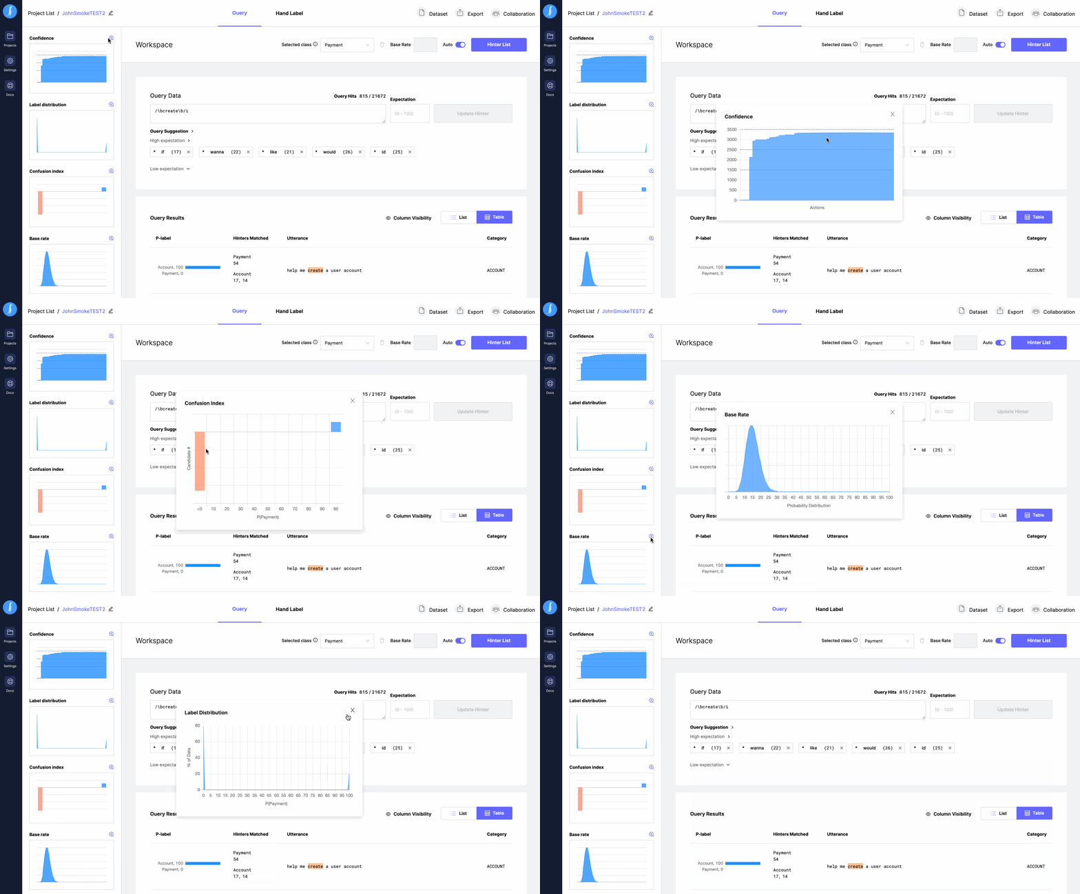
Chart Detail View
All charts are expandable by clicking the Magnify Icon above the chart. A popup window will let you drill into the chart in more detail.
Base Rate Chart
Base Rate measures the overall makeup of a dataset relative to a class. Watchful uses the base rate for a class to calibrate its confidence in being able to label for the class. You can either hand label a small sample of data to have Watchful estimate the base rate, or if you happen to know it offhand you can enter it directly.
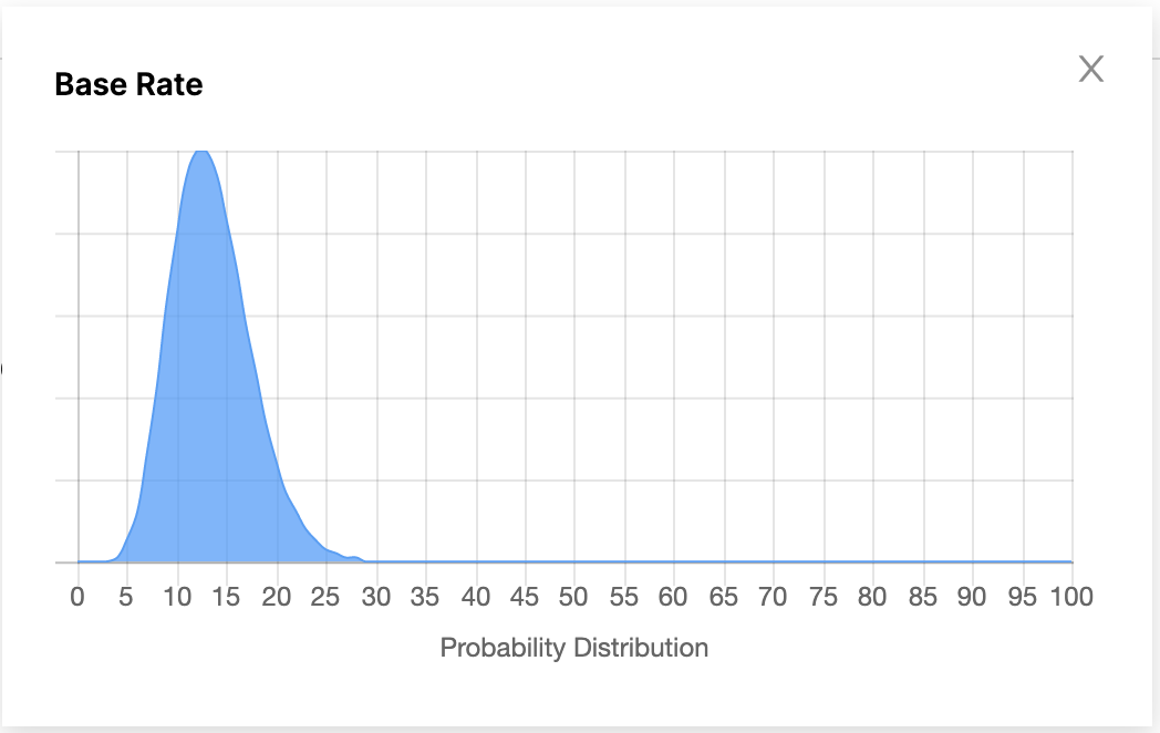
As an example of how Watchful uses the base rate: say you were given a dataset and knew nothing about it other than the fact that Class A makes up about 35% of it, and then given a random row from the dataset and asked the probability that it belongs to Class A. You would likely answer with "35%", as your "prior" is simply the base rate of the class. As you learn more about the class you would be able to answer more confidently - likely handing out probabilities closer to 100% or 0% more frequently. Your confidence in being able to label the class increases as your predictions move away from the base rate.
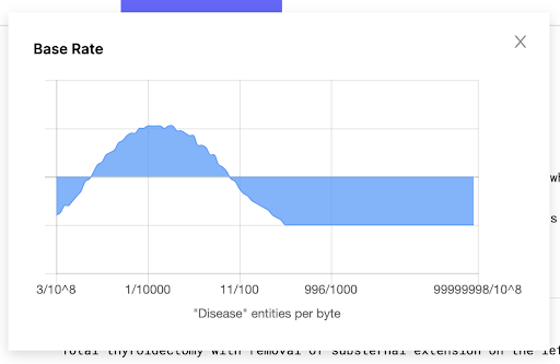
In Named Entity Recognition, base rate is calculated on entities per byte of data, as opposed to rows of data. Therefore, the base rate isn’t impacted by the number of rows in the dataset, but rather by its size. For example, if your dataset is 1GB - or 1 billion bytes - and there is 1 entity per 100k bytes, the base rate would be 1/100,000, or 10,000 entities in the entire dataset.
In the image below, Watchful is confident that the base rate is right around 1 entity for every 10,000 bytes. Where the distribution falls below the x-axis - such as at 996/100 - those base rates are less likely to be the true base rate.
Confusion Index
The Confusion Index chart allows you to get a sense of the quality of your labels. Intuitively, if you hand labeled a candidate positively for Class A, you would want the probability assigned to that candidate by Watchful to be high. Similarly, if you indicated a candidate is not a member of Class A, you would want the probability assigned to that candidate to be low. The hand label chart gives you a quick overview of the things you hand labeled relative to the probabilities assigned to them.
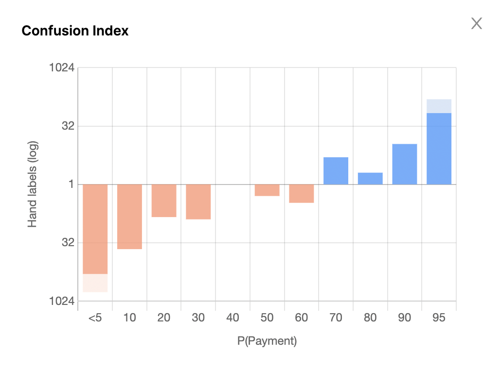
If all of your blue bars are to the far right of the graph, and all your red bars are to the far left, your data is in great shape! What this indicates is that everything you had hand labeled is getting probabilistically labeled by Watchful correctly.
If you wanted to further build your confidence in the quality of the probabilistic labels, simply hand label more data and see if you can find places where Watchful might need more signal.
Label Distribution Chart
Label Distribution refers to the overall distribution of probabilities in your dataset. Say that you've found that your Base Rate is ~20% for a class. Your goal would be to strongly label that 20% to be positive for the class, and the other 80% of the dataset would be strongly labeled to be negative for the class. When you first start out, however, you'll notice that your Label Distribution chart indicates that most of your data has approximately a 20% probability of being a part of the class.
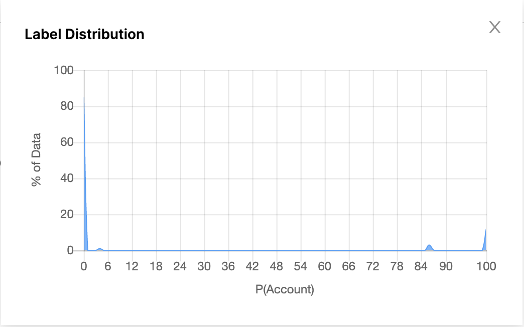
This makes sense, as the system currently has very little signal to go off of. The strongest signal it has is that the class has a 20% presence in the dataset - which means that every candidate has a 20% chance of being a part of the class. As you create hinters, you add more signal to the system and you will see that the label distribution chart will start shifting. The candidates that are strongly covered by positive hinters will move to the right of the Label Distribution chart, and the candidates that are strongly covered by negative hinters will move to the left. Eventually, the Label Distribution chart will reach an "ideal state" where 20% of the data is strongly labeled positively, and 80% of the data is strongly labeled negatively.
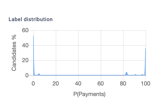
If your Label Distribution chart looks like a sharp 'U', with your Base Rate percent of the dataset to the right of the graph and the rest of the data to the left - you might be done labeling for that class.
We recommend using a combination of the charts above to estimate the quality of your labeled data.
Updated about 3 years ago
